Saturday, 21 February 2009

URBAN LEXICONS

You have come to the the research and archive blog of the Urban Lexicons: Impact of the Unknown project. 

To see the outputs of this project and contribute to its further development, please visit www.urbanlexicons.com, and send any us suggestions via the site.

Thankyou!

Rosanna and Marcus

Tuesday, 22 April 2008

DETAIL IMAGE CLOUD


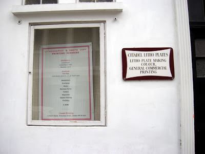
Click the image to see some example images of what types of details we are interested in ...

Tuesday, 8 April 2008

Visual Research


The chart could prove a useful way to compare the information we gather from the different sites and from different people. It's taken from the LSE cities programme.

The stickers are from an IDEO guide to London, and might be a nice way to summarise what people feel are the best / worst of each place. Could be stuck on a map to locate the detail in the space, or over a photo?

Thursday, 3 April 2008

Visual Inspiration : Typographica


A few spreads from Typographica, a pioneering design magazine published in the '60's. These spreads relate to Design Underfoot, and photoessay titled Street Level.

Sunday, 30 March 2008

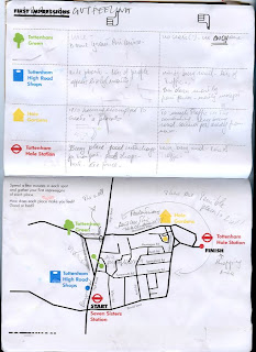
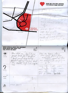
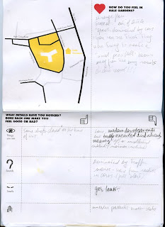
Test run tours: Tottenham and Archway


I ran a series of trial tours last Monday, to see how people really repsonded to the maps and methods we'd designed. Two partcipants toured defined points in Tottenham and Archway.

Its probably easier for the visuals to speak for themselves in the first instance, and then I'll go into detail onto what they felt, which details stood out, and how they found the whole experience in general.

Thursday, 21 February 2008

Play Rethink - Eco Gaming

An interesting activity set up to get people thinking creatively about eco design issues ... http://www.playrethink.com/

Friday, 15 February 2008

Participant Activities - sensorial heightening/ restriction


Headphone image source: http://2.bp.blogspot.com/_OAnjrFxpJMg/R7W91_jfPVI/AAAAAAAACrE/rLm5nl-OYhU/s1600-h/headphones_earmuffs.jpg

Thursday, 14 February 2008

Participant Activity Development - Opinions from an Illustrator and an Interaction Designer

Today we consulted Interaction Designer Andy Huntington and Illustrator Micahel Salmon for their opinions on how we might make the forthcoming outings interesting and useful (to help reveal and unravel 'urban lexicons'). Here are some of the comments and notes:

- Maybe Outing 1 should be with very little preempting or props and very little in-visit evaluation. .. Just a 'find your route to and through the spaces' outing first and ask for general first impressions: what do you remember, how did you feel, what did you like/ dislike?
- After visit could have cloud of words which Participants circle ,or hidden buzzwords, which we log/ map if they say them.
- Don't introduce too much info or description or request for evaluation before Visit 1.
- Then Outing 2 could be more evaluative, with a camera/ voice recorder or similar.
- If we use a form or Participant Comments Card it could be filled in on the tube, between sites, to make the most of time available.
- Still picture and audio voice recording of why each detail is taken (visit 2).
- Taboo-like game could mean not allowed to use specific words to describe feelings or place - eg, not not allowed to say nice, or like, or good.
- Could not all start together, but could agree to all end together by meeting in specific place.
- First day really quick?
- Give drawings simplified map?
- Visit 1 in one direction and Visit 2 in the other direction.
Give/ draw simplified map for each area.
- MW take 2 people round, RV take 2 people round to avoid too much delay with staggered starts.
- Could give arrow or pointer for people to locate in view for each photo, so it is clear what is being phtographed.

Participant comment card - draft idea

Wednesday, 13 February 2008

Notes on Participant Activities - game/ task idea

"Find that Detail"

Notes on Participant Activities - possible questions

Possible questions for Participants:

• Would you ... here?
- stop
- shop
- sit
- eat
- relax
- meet friends
- visit (as destination)
- live
- work
- comfortably take a route through


• What details of this space/ place influence your desicions about the above question?


• Draw or write the 3 ideal activities and corresponding 3 ideal features (sensorial) or characteristics for the following types of space:
- Transport interchange
- Green space (park etc)
- Residential space
- Commercial space

Notes on Participant Activities - sample tasks

Some ideas and notes around possibilities for participant activities and how we could conduct the outings ...

Sample tasks:
"Choose and document 5 different details in the space. Photograph the details and write one word for how each detail makes you feel about this place."|

"Grade the place on if it makes you feel good, or bad, overall: 1 being bad, 10 being good."

Notes on Participant Activities - planning thoughts

Some ideas and notes around possibilities for participant activities and how we could conduct the outings ...

- Pre-briefing, to equip participants to look for design/ sensorial related details?
- How to make it simple enough to find the details?
- Game-like activities?
- Role-play? Theatre?

Notes on Participant Activities - Filming & Editing

Some ideas and notes around possibilities for participant activities and how we could conduct the outings ...

Filming & Editing
- Intimate 'over-shoulder' filming
- Recording person's 'eyes' - 'Participant eye view'
- Key words spoken/ recorded can be highlighted during editing, or on map - eg. comfortable, free, relaxed, busy, stressful ...
(after speaking with Johanna)

Tuesday, 5 February 2008

Golden Oldie


As part of my walk last week, I got a sudden positive rush upon seeing this building.
What happened?

I think it's down to it being in such good condition yet very old, and the suggestion of love and care that that implies. If a building has survived hundreds of years and tenants, and is still standing, there's an association that someone has cared and invested in it (time, money, hard work, etc). It suggests a place belongs to someone; there are lives and people behind it.

All of these positive associations are transferred onto the street.

It could also have something to do with the context.
Take a look at the 'fortress' that is Mount Pleasant post office that faces this building and you see the contrast of love and hate.

Monday, 4 February 2008

Hansel & Gretel


Based on Charlotte's idea to do the walk alone, then return and retrace your steps, I tried a 'sticker walk' this weekend. I took a walk from Pentonville Road to Holborn, placing a small bright orange arrow on any specific elements that stood out as immediateley positive or negative to me, and then walked back to analyse them at a slower pace and take a photo.

Again, an element of curiousity came into the positive, as well as 'signs of life'. One of the most memorable was a hole in either side of the railings in a small park near Kings Cross. The hole was followed by a worn down path which had almost been ceremoniously marked by placing a cut branch on either side. Some people might have seen it as vandalism.

It worked well as a technique, allowing you to move at a natural pace. But is biased towards visual standout of stationary objects, as anything that moves, smells or any sounds won't necessarily be there on the way back.

Walk to work


I've started walking to work, intentionally taking routes down back streets that I don't know. It's a 20 minute walk from Barnsbury to Covent Garden; I'm seeing new things every day and feel as through I get to work with a story to tell. There's something to be said for the unknown...

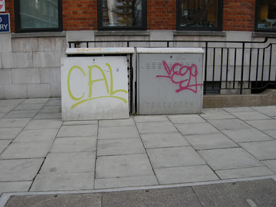
I've gone out with the brief to take a photo of positive and negative elements along my way, but quite often find that positive for me means unusual as it sparks curiousity; an old lamp light, a shop bench, graffiti on a telephone exchange box that looks like its on display in a gallery. My view is by no means typical, but still valid, nonetheless.

Participant Outing: 2


Different participant, different country. This time, Charlotte, a 27 year-old British girl on holiday in New York. We took Charlotte to Harlem one Sunday, an area of New York she had never been to. She had some preconceived ideas, having heard that Harlem had a reputation for being dangerous, and was a little apprehensive. She'd spent most of her time in downtown New York, which has a much smaller, tighter street pattern, and in her words, a very different feel.

She took photos as she walked of things that made her feel positive or negative, but found that in itself disconcerting. 'I don't feel comfortable taking my camera out here' she said. I questioned her as we went, trying to establish what made her feel that way, recording her thoughts on a dictaphone. She suggested talking might be a more successful way of finding out what people thought, for ins

Overall, she felt wary, and said wouldn't want to come back.

There were far fewer people around than in downtown New York, maybe because it was -2, maybe because it was Sunday. The shops were shut, and generally had nothing of interest to her; a laundromat, a liquor store; few details for her to read the city with. The wider pavements made it harder for her to grasp a sense of the area. She couldn't place what kind of neighbourhood it was either, with a renovated house next to one falling apart. She found the fact that there were so many churches positive – Charlotte has been brought up a Catholic – and could hear snippets of music coming from within them.

She made some suggestions:

• GO IT ALONE Make a first outing by yourself, but with the reassurance that Marcus or I are somewhere along the route, or following from behind. That way you get a true first impression, without putting the participant in any real danger.
• Or...ON THE PHONE Call the participant whilst they're walking and get them to describe how they feel. People feel more comfortable talking on the phone than talking photos. Its an everyday activity that doesn't make you stand out.
• BREADCRUMB TRAIL Let them take photos by themselves and once they reach the end of the trail, retrace their steps back, Hansel and Gretel style to analyse them with Marcus and I.

Monday, 7 January 2008

Participant Test Outing 01


We conducted the participant test outing in London's West-End/ Soho area, giving the participant a map of the area and highlighting 5 key spaces she had to find her way to from the starting point at Cambridge Circus.

We also gave her a camera, a very basic pen-voice-recorder and a notepad.

The key spaces were:
Denmark Street (commercial)
Tottenham Court Road Station, South-West exit (transport interchange)
Soho Square (residential and green)
Frith Street (residential and commercial)

We quickly noticed that to manage the route with the mapa, the camera, the voice-pen and take notes was asking too much, so we walked with the participant and asked questions and took notes ourselves while she was feeding back.

It was hard to get her to focus on small scale details, but as she got the idea of the sorts of questions we were asking, about why she felt how she felt about the different spaces, she started to give more specific feedback.

We need to develop some very specific questions and tasks to get the participants to feed-back observations that will be most informative for this project.

At the end of the oouting, we sat in a cafe and the participant drew a map of where she'd been, without looking at the one we'd given her. She then noted comments on the map about her impressions, also noting a score of between 1(low) and 10(high) for her overall impressions of each of the sites she observed; ie are they positive or negative, 'Do' or 'Don't' spaces.

A scan is posted above.

Here is a scan of the second half of the visit notes...

Participant Test Outing 01

Participant Test Outing 01

Spatial Scoping Study 6 - Whittington Park

Spatial Scoping study 6 - Whittington Park

Scoping Study 6 - observations from other areas

Spatial Scoping 6 - observations from other areas

Wednesday, 14 November 2007

A spatial scoping study 1: Seven Dials & Whitfield Gardens


Sample findings from an initial scoping study starting in Seven Dials and continuing up to Whitfield Gardens, off Tottenham Court Road.

It's interesting to note that the hub of Seven Dials is a roundabout that says 'yes'...
whilst the Whitfield Gardens has been designed to give it a sense of place, yet is missed by passers-by.

View details mapped

Tuesday, 30 October 2007

Secured by Design Principles: excerpt

source: http://www.securedbydesign.com/pdfs/SBD-principles.pdf

2 Environmental quality and sense of ownership

Poor environment: alienation and fear
2.1 A poor quality and sterile environment can create feelings of alienation amongst residents and other users, and result in an area where people feel uncomfortable, where pride and sense of shared ownership of the environment is low. .Few people will want to linger in public spaces where crime and disorder/or fear of crime is high. In the extreme, this might be the bleak inner city “concrete jungle” characterised by barbed wire and heavy duty security hardware on buildings, where broken glass and graffiti are commonplace. To varying degrees however, similar effects may be seen in other less severely degraded urban environments. Well-designed environment: community cohesion Secured by Design Principles 2004 version 1  ACPO CPI June 2004 6
2.2 In an environment which is well designed, attractive, clearly defined and well maintained people are likely to take pride in their surroundings, will tend to feel comfortable and safe and have a sense of shared ownership and responsibility.
2.3 A ‘well designed’ environment is one that fulfils all its intended functions in an effective and harmoniously co-ordinated manner.
2.4 An ‘attractive’ environment in this context means one which has evolved or has been successfully designed to meet the needs of its legitimate users, such as the need for safe convenient means of access, the need to enable social interaction, to cater for recreational needs, etc. Legitimate users (ie the responsible majority of the population) will naturally find the environment ‘attractive’ because it is responsive to their needs. The greater the attraction for legitimate users, the less will be the attraction for the criminal minority.
2.5 A ‘clearly defined’ environment means one in which there is no ambiguity as to which areas are private, which are public, and how the two relate to one another. There may be transitional zones of semi-public or semi-private space [often referred to as ‘buffer zones’], or there may be strong physical demarcation between public and private areas by means of a wall, fence or hedge. The critical point is that the environment should be capable of being easily ‘understood’ by those experiencing it.

Anonymity

2.6 Crime is always easier to commit where offenders cannot be recognised, so in consequence they will take opportunities to offend where they are likely to benefit from this anonymity. The built environment, including areas of open space, can be organised so that it either creates the potential for, or alternatively reduces the levels of anonymity. In busy public places strangers will naturally tend to be ignored, and offenders can take advantage of this anonymity, and therefore opportunity, to commit offences. This can lead to problems where public space directly abuts private space because it can allow potential offenders to come into close proximity with private property without being noticed. This problem can be addressed by changing the nature of the part of the public space nearest to the private land or property, by reorganising it so that residents/property owners are able to exercise a degree of control over it, in effect creating a buffer between the wider public space and the private space. This ‘buffer’ might or might not still be legally public space, but if it is reorganised or redesigned in such a way as to create a zone of more ‘defensible’ space, anonymity will be reduced and potential
offenders will correspondingly be discouraged.

Tuesday, 23 October 2007

Signs of Life - part c - Whyte quote

“It is difficult to design a space that will not attract people - what is remarkable is how often this has been accomplished.” Today, many public spaces seem to be intentionally designed to be looked at but not touched. They are neat, clean, and empty - as if to say, “no people, no problem!” But to us, when a public space is empty, vandalized, or used chiefly by undesirables, this is generally an indication that something is very wrong with its design, or its management, or both." William H. Whyte

Haque

Environment XML
Environment XML enables people to tag and share remote realtime environmental data; if you are using Flash, Processing, Arduino, Director or any other application that parses XML then you can both respond to and contribute to environments and devices around the world.

Signs of Life - part b

In terms of fear or security, it seems an environment covered by a heavy cctv presence can indicate a place with real problems in the human activity it commonly sees. Equally a very high wall or fence, or even inappropriately bright lighting. What kinds of life do we imagine in these places? What other examples can be found?

Signs of Life? part a

Speaking to a few people about this project, I have been getting feedback that one of the important characteristics people look for, or more importantly 'sense' for, when they encounter a new place is whether there are any signs of life, and if so what kinds of signs are those? They can be negative or positive, it seems.

Monday, 22 October 2007

Details: Richard Wentworth and Jane Sulton Furi


This 'Industrial Design Supersite' has a great article on Richard Wentworth (artist) and Jane Sulton Furi (founder of IDEO)
looking at http://www.core77.com/reactor/03.07_parallel.asp

Jane Sulton Furi has a whole site dedicated to the subtle ways in which people react to the world around them, including a collection of many people's images and stories. She categorises these seemingly 'thoughtless acts' as reacting, adapting, co-opting, etc. Ways we engage thoughtlessly. Fulton Suri has used these categories as an organizing principle, and believes such details reveal larger patterns and bigger insights.
http://www.thoughtlessacts.com/

Although their visual outcomes are not dissimilar, what's interesting is the artist's more serendipitous perspective on the world in comparison to the designers. Yet Wentworth also categorises: "It doesn't take very long to realize that some are warnings, some repairs, some reminders, some adjustments." As the author states "Where others may have simply seen a sandwich—if anything at all—Wentworth notices the details which fit his world view."

New Barking Town Square

Barking town square in construction


Barking and Dagenham council have embarked on an impressive regeneration programme, with a central focus on the town square. This was previously a wind swept, concrete-paved square that housed a carpark, and although adjacent to the library and town hall, was seldom populated. there was just no reason to be there.

The construction is nearing completion (if not there already), and could prove an interesting study site, as could be contrasted with the nearby station (which is downright nasty), and has made unusual use of details (colour, material etc) in a previously expansive space.

Flickr site of some 'Impact of Unknown' images (mw)

http://www.flickr.com/photos/willcocks/sets/72157601836367126/

Space-Genre-Categories

• Greenspaces
• Residential areas
• Retail/ Commercial areas
• Public transport interchanges

Participant-User-Categories

Tourists: little knowledge of a space, different cultural codes.
Night-time users (shift-workers, revellers): knowledge of a space in time-based context.
Commuters: limited knowledge of non-transport spaces that form transient parts of their journey.
Residents / walkers: in-depth knowledge of a space and social make-up